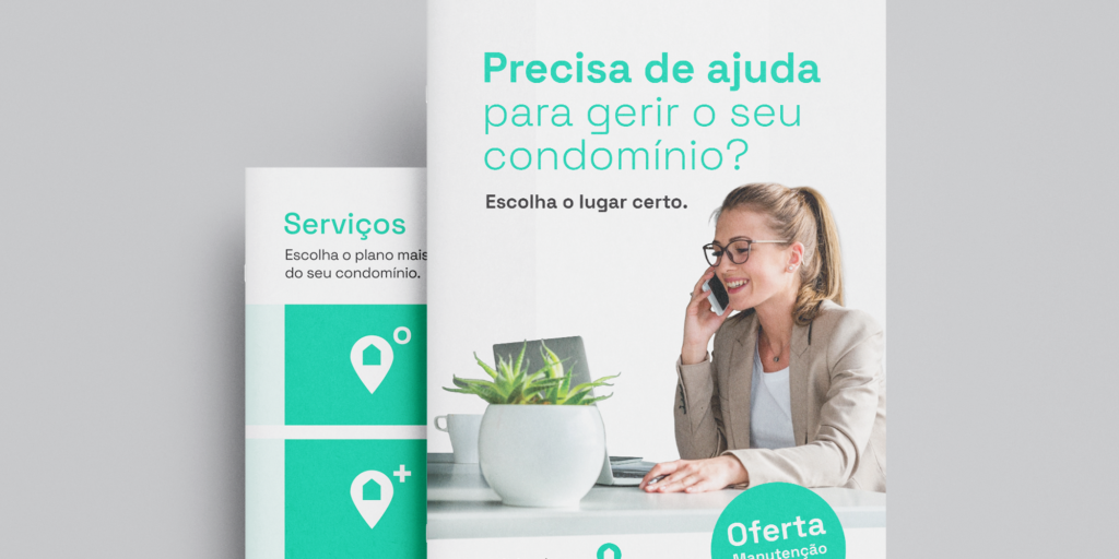
CHALLENGE
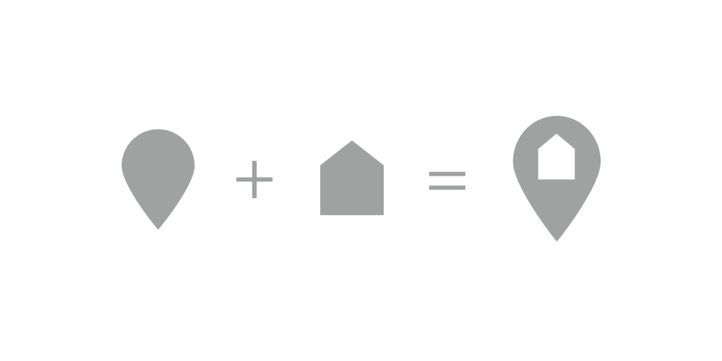
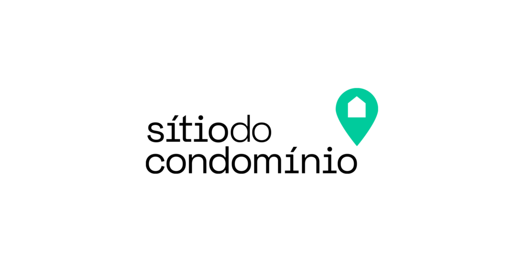
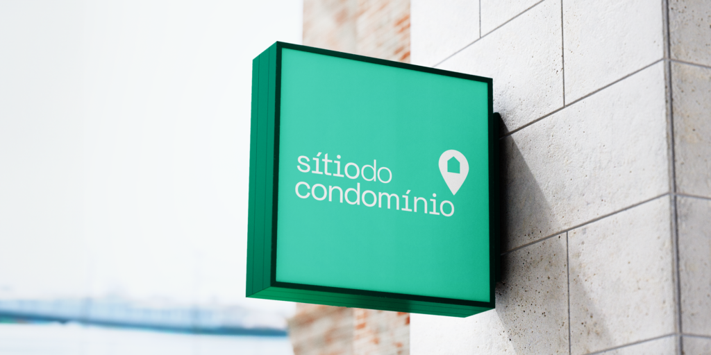
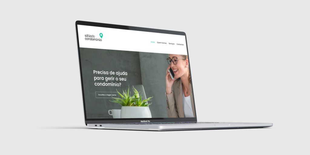
Create a visual identity that embodies the essence of “Sitio do Condomínio” (Place of the Condominium) – a place of healthy management. We sought to integrate elements like a map pin, symbolizing location, and a house enclosed within it, representing the concept of a remarkable place. Our goal was to make the logo simple, modern, and reflective of the tagline “Gestão no Lugar Certo” (Management in the right place).
INSIGHT
Through careful consideration, we recognized the importance of representing the concept of healthy management within the logo. By enclosing the house within the map pin, we aimed to convey the idea of centralized and efficient management, ensuring that residents feel secure and well-cared for in their environment.
IDEA
Create a sleek and contemporary logo design, seamlessly merging the elements of a map pin and a house. This harmonious fusion not only reflects the essence of “Sitio do Condomínio” (Place of the Condominium) but also communicates accessibility, modern living, and a sense of belonging. With the tagline “Gestão no Lugar Certo” (Management in the right place), our logo reinforces the promise of efficient and effective management services in the ideal residential setting.