CHALLENGE
Our challenge was to develop a visual identity that not only encapsulates the essence of the real estate market but also embodies a human-centred and personalized approach. We aimed to showcase the agency’s dedication to its clients, emphasizing the professional team committed to customer satisfaction. Our inspiration stemmed from the joyous expressions of buyers and clients, fostering a sense of unity and connection.
INSIGHT
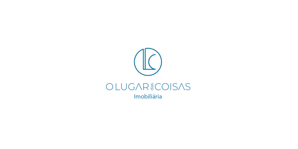
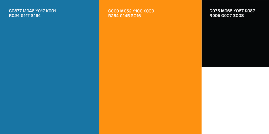
Recognizing the pivotal role of the human element in driving innovation, we conceived a logo design that seamlessly integrated the agency’s initials into a cohesive circle, symbolizing the completion of a cycle. Opting for a sans-serif font, we sought to merge the elegance of typography with architectural elements, reflecting both professionalism and sophistication. The choice of blue as the primary colour was deliberate, evoking feelings of security, trust, and tranquillity, essential qualities in the real estate industry.
IDEA
Our idea manifested as a contemporary and distinctive logo, blending refined typography with architectural nuances. The central circular shape signifies not only creative exploration but also stability and collaboration, echoing the agency’s commitment to excellence. This circular motif reinforces the notion of continuity and perseverance, echoing the agency’s dedication to guiding clients through their real estate journey with confidence and assurance.