CHALLENGE
Our challenge was to develop a visual identity that seamlessly integrates the irreverence and professionalism inherent in our advertising and design agency. We aimed to create a graphic emblem that not only embodies simplicity and modernity but also reflects our agency’s international essence.
INSIGHT
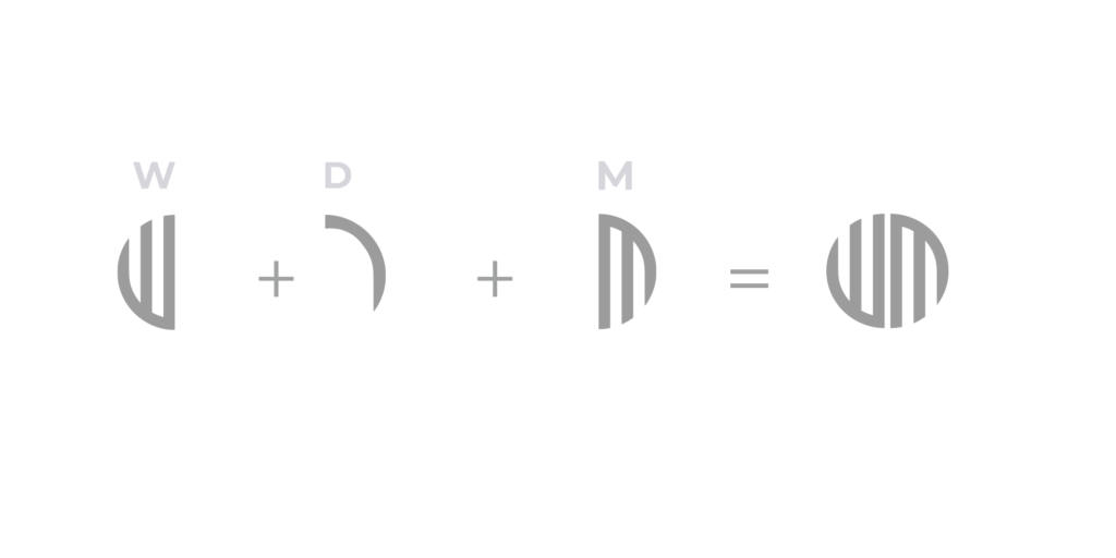
Recognizing the power of universal symbolism, we conceived a logo design that merges analogue and digital elements into a harmonious whole. The graphic representation of WDN initials forms the foundation of a circular shape, evoking both a perfect geometric form and the interconnectedness of our global presence. Opting for a structured and modern sans-serif font, we infused it with a contemporary flair to ensure the logo’s versatility and timelessness.
IDEA
Our idea culminated in a captivating and dynamic logo that invites viewers on a journey of creative exploration and trust. The graphic labyrinth of the logo shape serves as a metaphor for navigating the complexities of modern society with confidence. With a bold font choice, the logo exudes strength and adaptability, resonating with a diverse range of clients. This logo not only embodies the contemporary essence of our agency but also instills confidence in clients, assuring them of our ability to successfully navigate the challenges of today’s world.